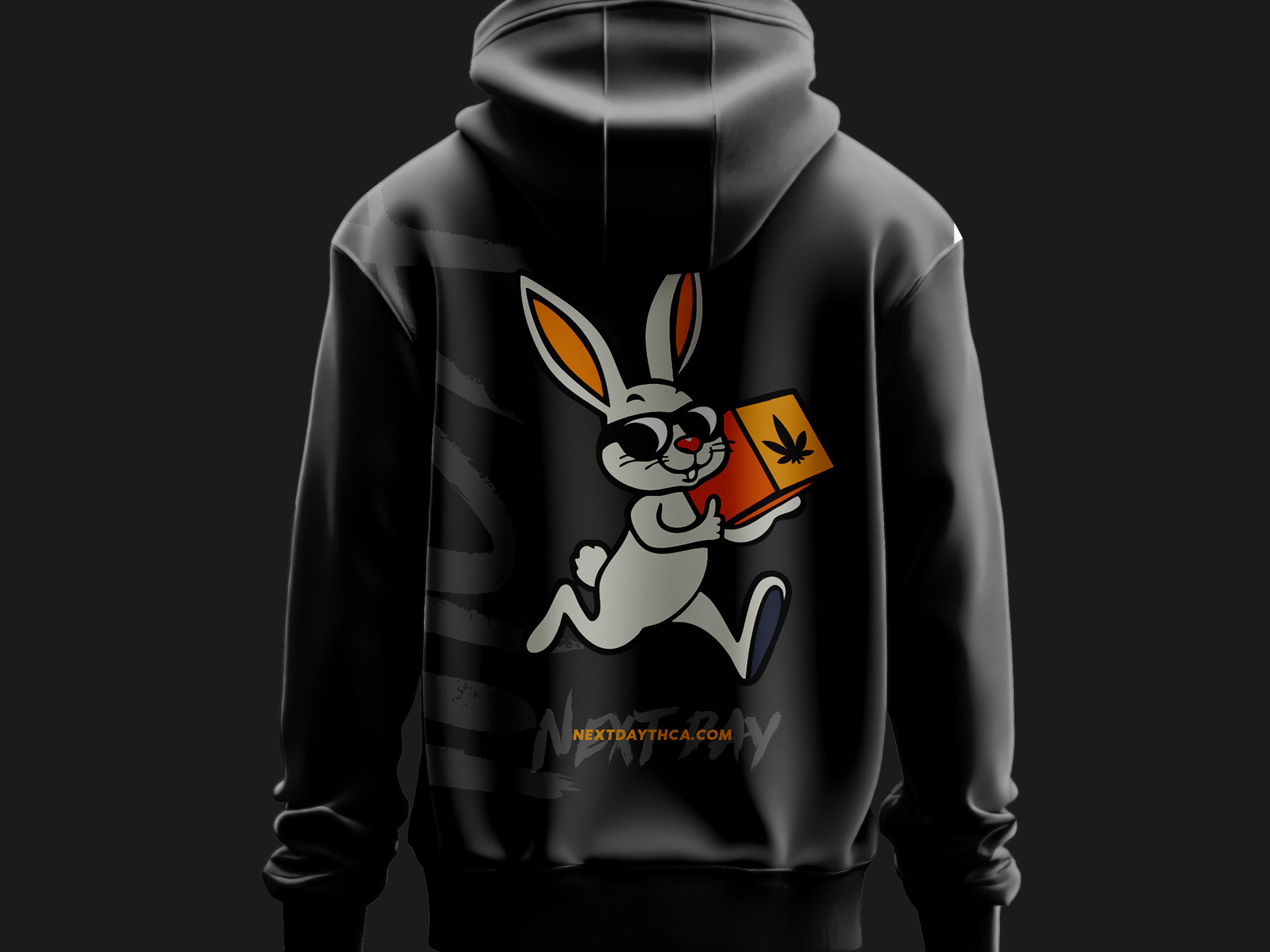

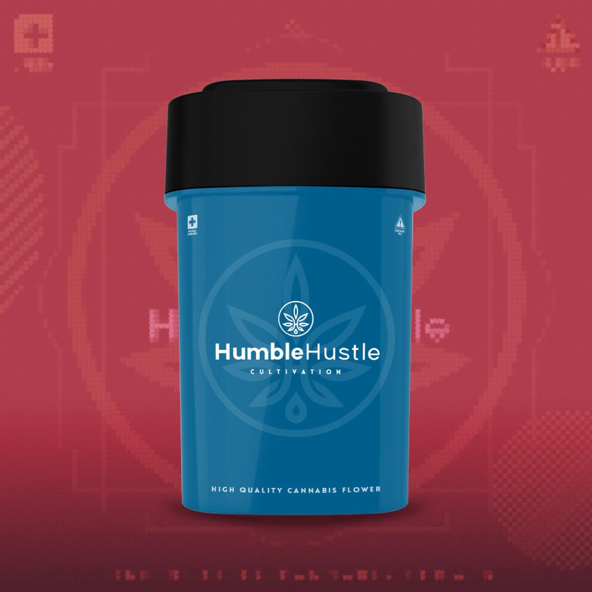
Design Process
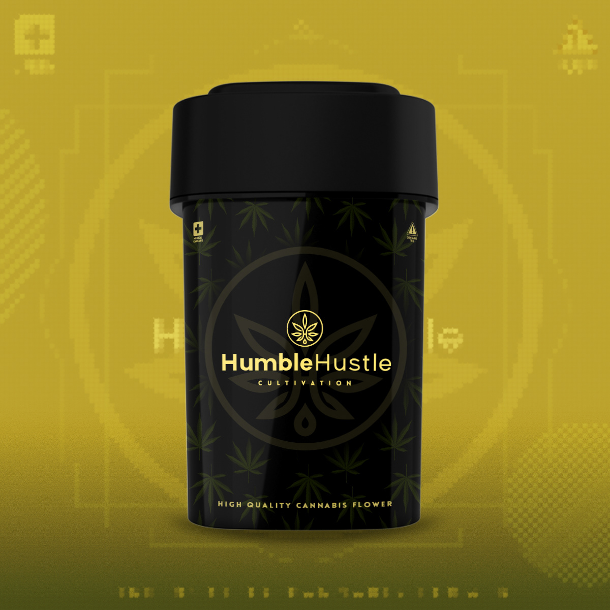
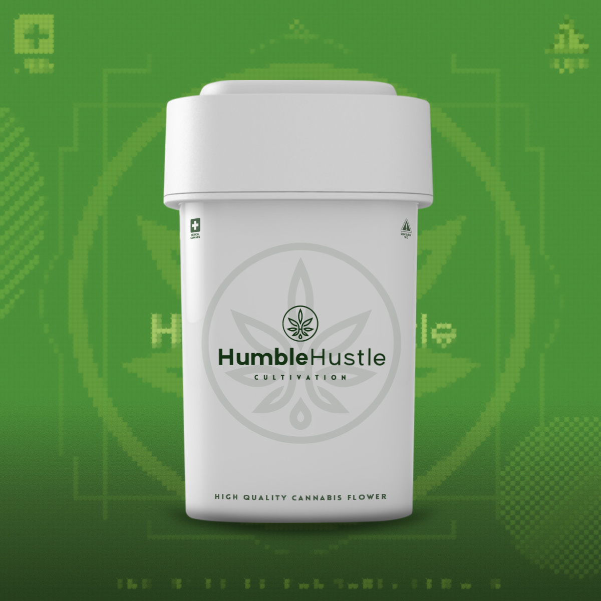
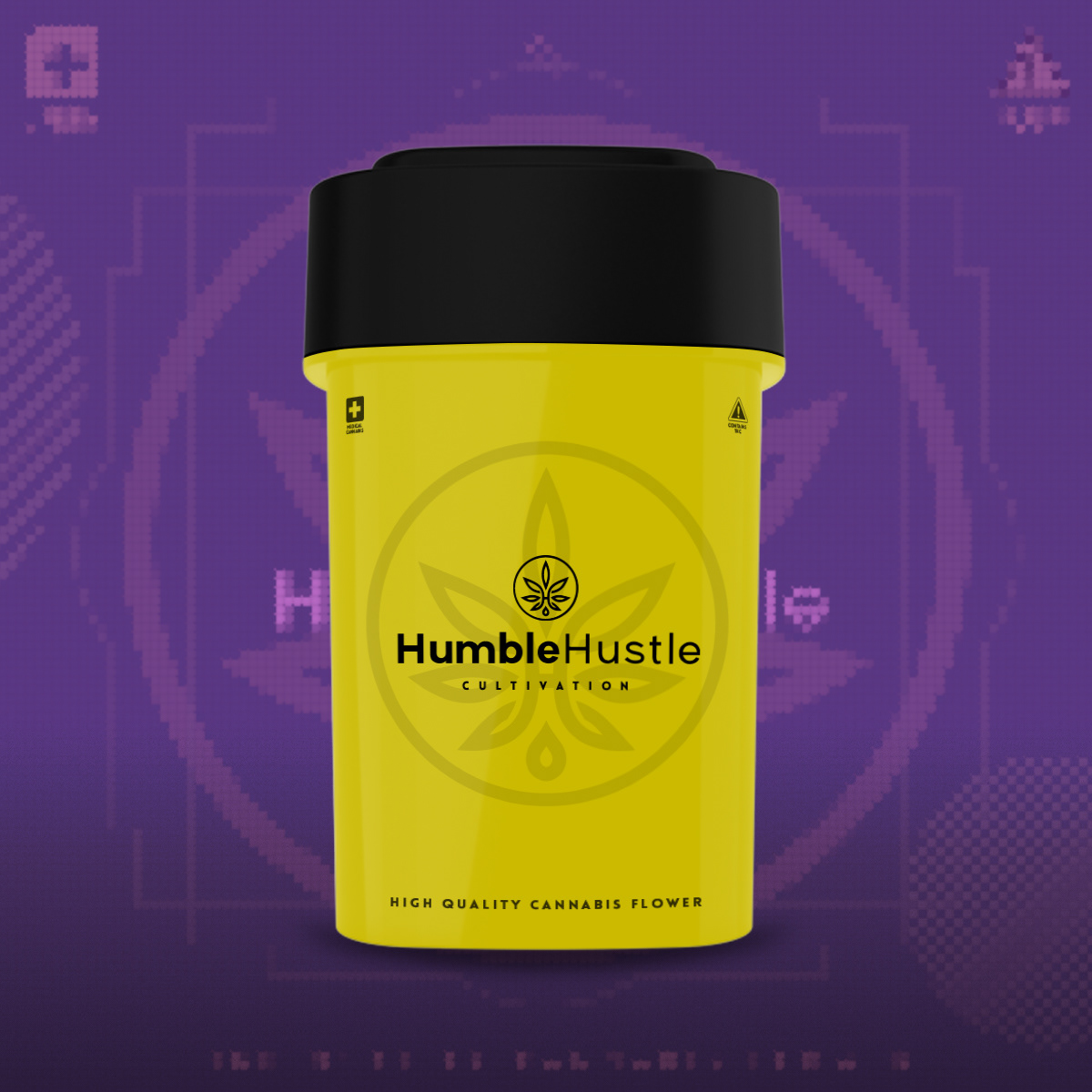
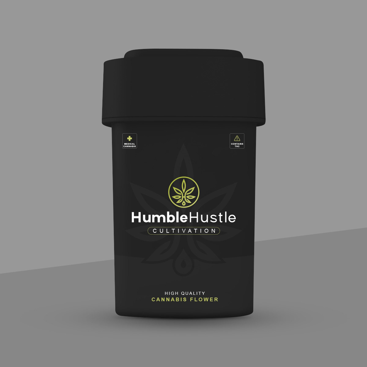
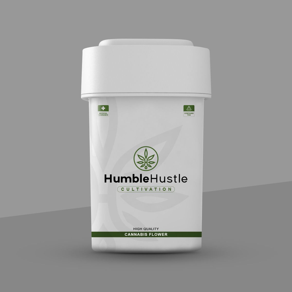
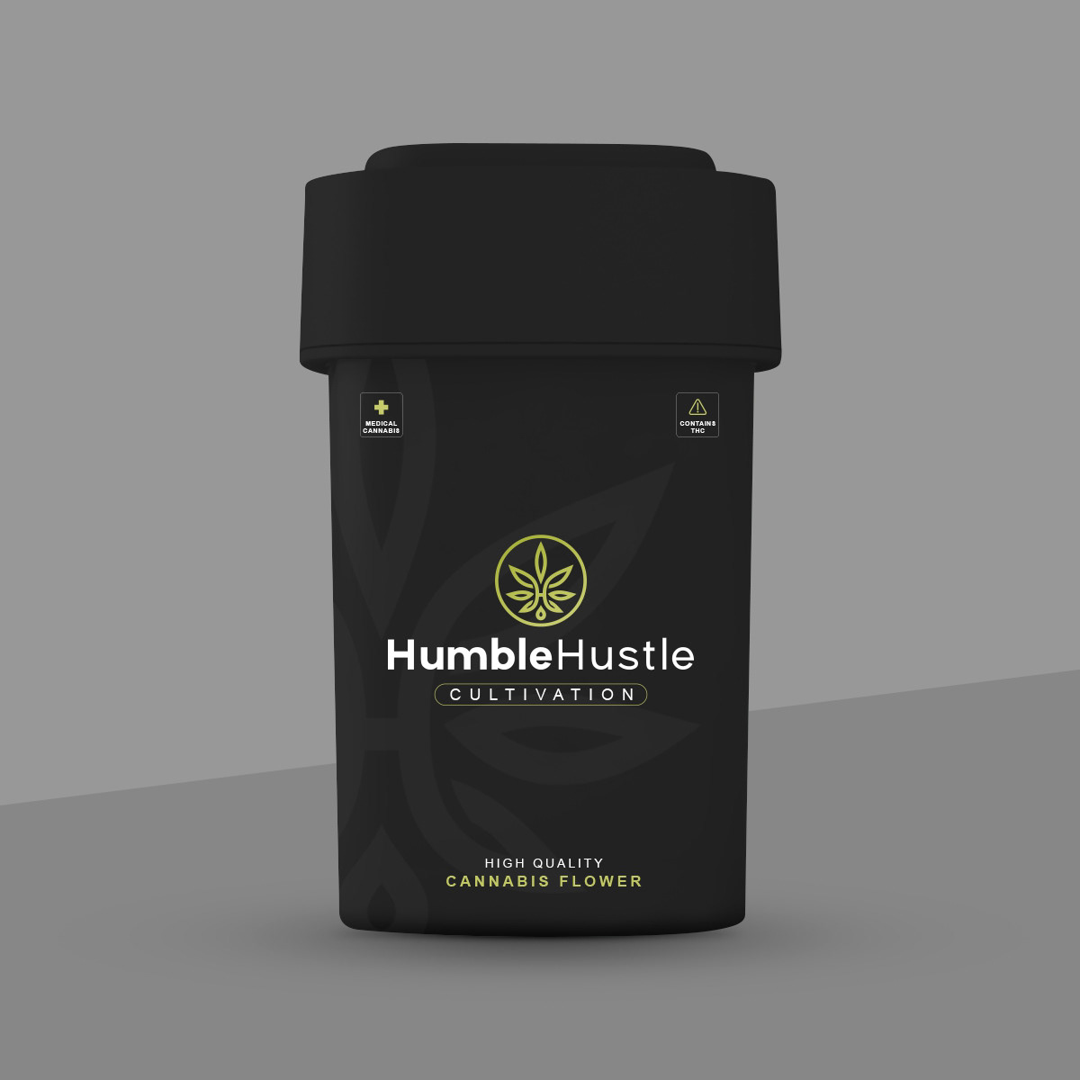
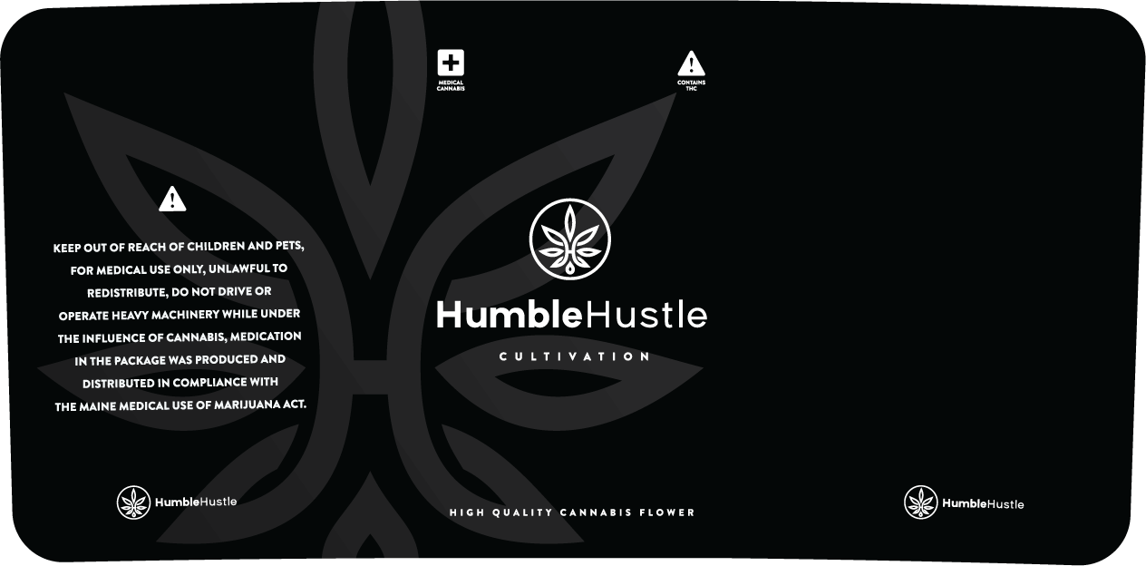
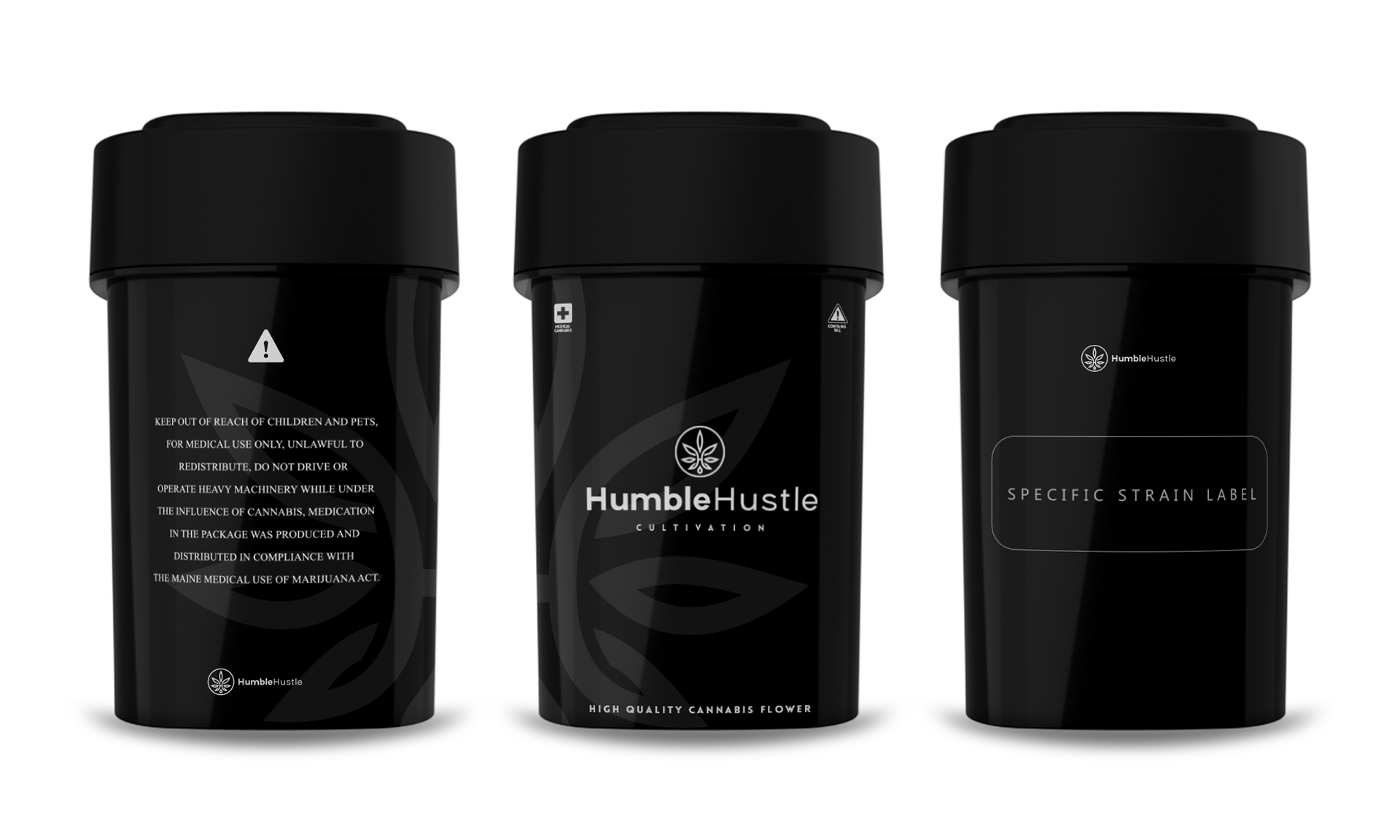
I began by exploring visual directions that blended organic elements with urban edge, using clean typography, custom iconography, and a refined yet earthy color palette. I paid close attention to layout hierarchy, ensuring product information and compliance details were easy to read without compromising aesthetics. The packaging was designed with real-world usability in mind, incorporating clear strain identification, THC/CBD markers, and tactile elements to enhance the unboxing experience.
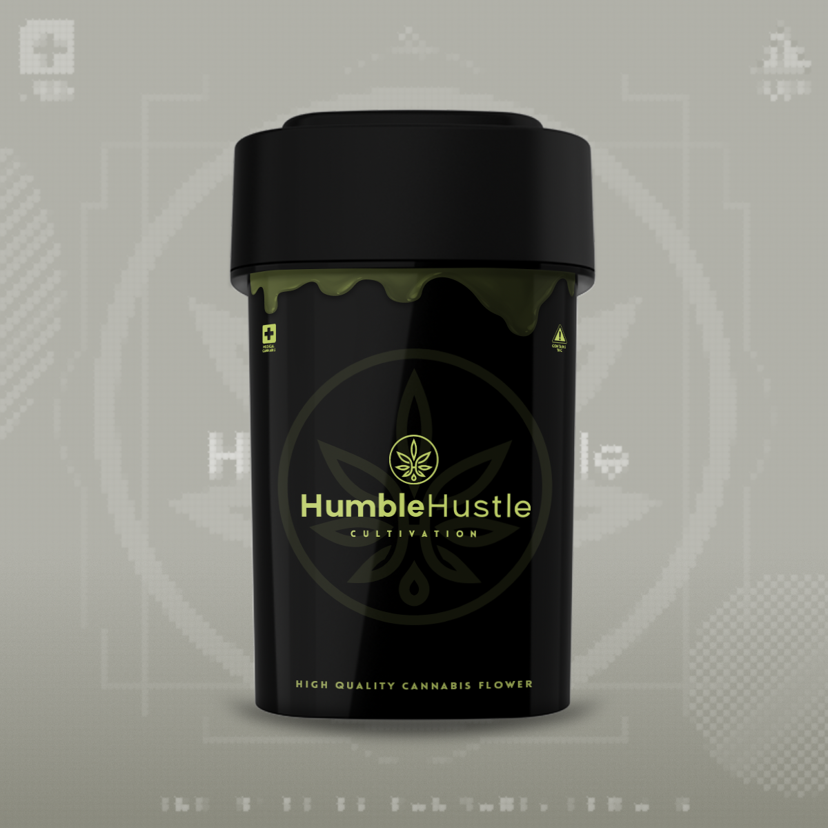
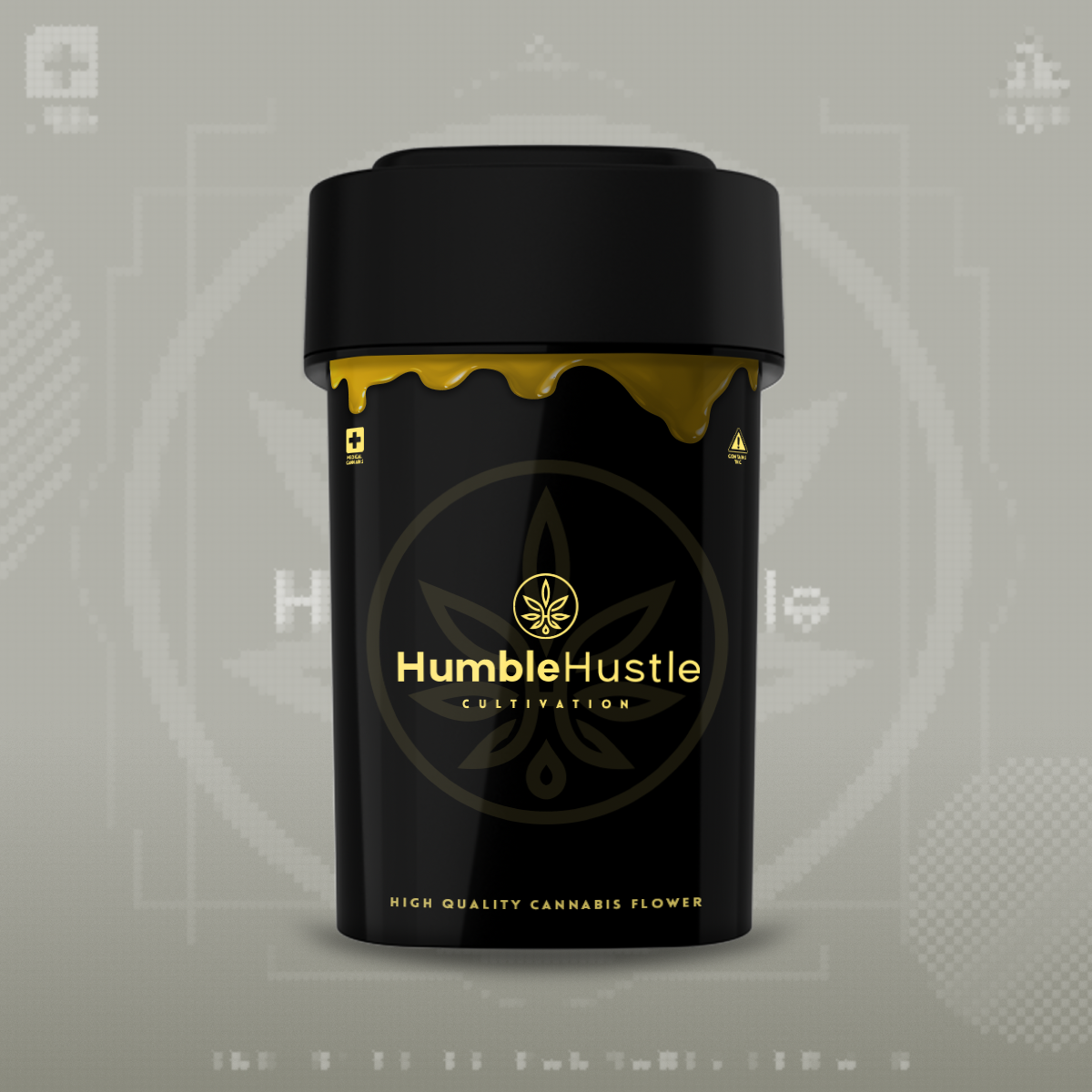
Refinement & Collaboration
During the revision phase, the client emphasized a desire to keep the packaging simple, using monochrome or 3-color palette - primarily to reduce printing costs and streamline production. This led me to revisit and refine my original concepts, focusing on clarity, contrast, and strong composition without relying on color. The challenge was to preserve a sense of boldness and professionalism within a minimalist black-and-white palette. Through close collaboration and thoughtful simplification, the final design struck the right balance between cost-efficiency and premium shelf appeal.
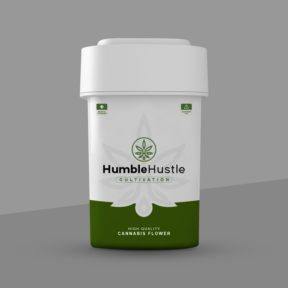
Result
The final design delivered a professional, eye-catching packaging system that communicated both credibility and personality. It successfully captured Humble Hustle’s essence while elevating the product’s shelf presence - giving the brand a distinctive visual identity that connects with its audience.

used a "squircle" before it was trendy :)